Everyone loves MailChimp.
If you've been working on WordPress sites for any amount of time, and you've helped a client get an email list set up, then you've likely worked with MailChimp. It's not only a powerful solution, but it also starts off free. And people love free.
So whether you're using MailChimp now or you have in the past, you likely know that one of the most requested features that you hear from a client is to create a form that looks great. And then they want it in all sorts of places.
The latest webinar or blog post will tell them (and I'm not complaining about this) to put their sign up form:
- Across the top of the page on their home page
- In the sidebar of every blog post
- At the bottom of the post
- Connected to each comment (as a checkbox below the comment)
- Connected to each purchase (at checkout)
- and more…
And what you soon realize is that each of those places likely requires a slightly different look and style—which is work.
The first time I tried styling MailChimp forms
The first time I tried to style a MailChimp form, I did it within the MailChimp interface. I went looking for their styling section and started working on creating a simple and clean form that would look good in my sidebar (my blog used to have a sidebar).
The reality of this interface was that it wasn't perfect. It took me several tries to figure out that I had to go to one screen to pick the fields, another to change the text, and another to adjust the colors. I'm not sure I ever figured out how to manage the white space.
What I recall was that I quickly settled for “good enough.”
The second time I tried styling MailChimp forms
The second time I tried to style a MailChimp form, I was actually styling a Gravity Forms sign up form that was integrated with MailChimp. I felt like that would give me greater control—which it did.
But if you know anything about Gravity Forms, you know that the CSS that comes with that plugin is the result of having to integrate with tons of poorly coded themes. So every single CSS declaration they make is !important; and that can be a serious pain to style.
I spent hours working on the CSS to get the little form to work the way I wanted. And I didn't want a lot. I simply wanted a colored widget background, with good amounts of padding, fields that had no labels (but put the labels in the fields as placeholders), and a submit button that was the same size as the fields.
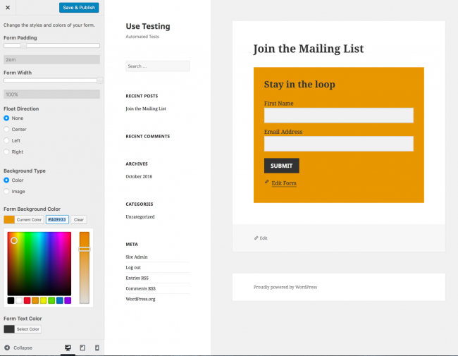
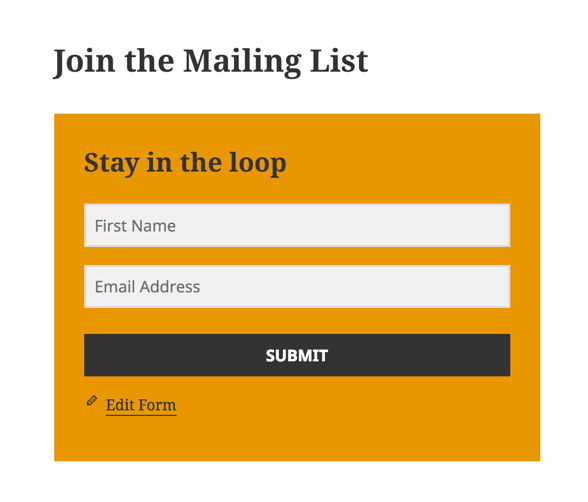 Basically, what you see above is what I wanted. And to do it, I had to write something like 18 lines of CSS that I saved to dropbox and kept on three different computers in case I ever needed it again.
I'm not upset that it took that much work. I understood why GravityForms CSS was the way it was. But once I had completed my task, I knew that I never wanted to do it again.
How I would do it now if I had to style a MailChimp form
The other day I started a project working for a client that wanted to redo a bunch of things to their site, and one of them was their MailChimp forms – styling them and putting them in all those cool places we talked about.
[tweet “If I ever have to style a MailChimp form again, I'll use Easy Forms for MailChimp by @yikesinc”]
So I set off on a mission to check out the best way to do it, while giving me all the kinds of control I wanted.
And I must tell you, that if I ever have to style a MailChimp form again, I will be using the solution that I found and tested this week—from Yikes.
Their product is called Easy Forms for MailChimp and they're not lying.
Their feature list is massive and their add-ons are excellent. But if you check them out in the repository for free plugins, you'll likely not grasp how awesome they are because the long list of features just washes over you. I know they have a video there, but I never watch those.
So let me tell you why they're amazing.
Integrate your forms with everything
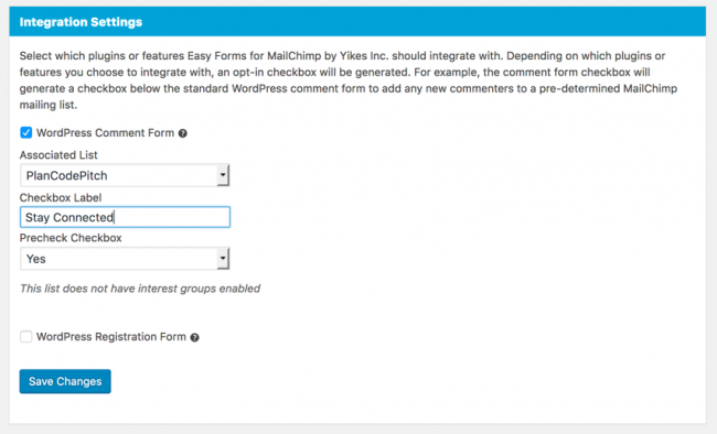
This free plugin allows you to integrate your form sign-ups with everything under the sun. From comments (where you just show a checkbox to subscribe people who have just commented on your site – and given you their name and email) to all these other plugins.
- WooCommerce
- Easy Digital Downloads
- BuddyPress
- BbPress
- Contact Form 7
Style all your MailChimp forms for $20
I've not always been a fan of the customizer—the sidebar on the right that lets you make changes to a variety of visual components on your WordPress website. I find that there are many things that people put there that only add to the clicks and confusion of end-users. But this isn't one of those times.
Easy forms is free, but their extension that allows you to style each and every form via the customizer is pretty amazing. And it only costs $20.
Don't take me at my word—check out how incredible this interface is.
And here's the place where I changed the labels to fit in the placeholders.
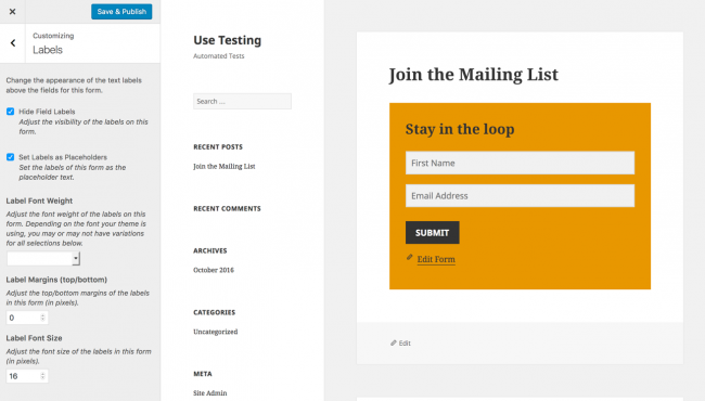 And of course, by now you know I was able to make that submit button stretch like I wanted.
Did I mention that you can get exit-intent pop-ups?
Now let me be clear—I love Optin Monster. It's amazing and powerful and does tons of amazing and powerful things.
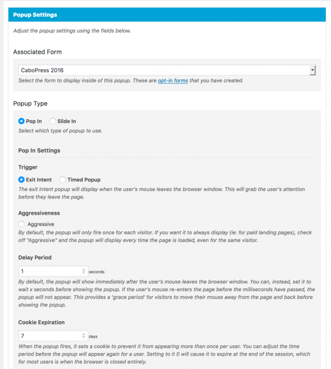
But did you know that for an additional $20, the pop-up extension will give you exit-intent features for Easy Forms for MailChimp?
You can determine how long to manage the cookie so that if a person closes it (without signing up), they won't get it again for however long you determine. You can also determine if you want to pop it up the very instant that the mouse moves out of the browser space, or give it a tiny bit of grace—which they call a delay period.
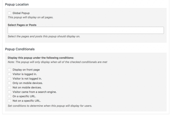 And just like you hoped it would offer, the extension lets you turn it off for mobile devices, which I really like. You can also turn it off for people who are logged in—which is great for membership sites.
It's easy. The core plugin is free. And it takes away stress.
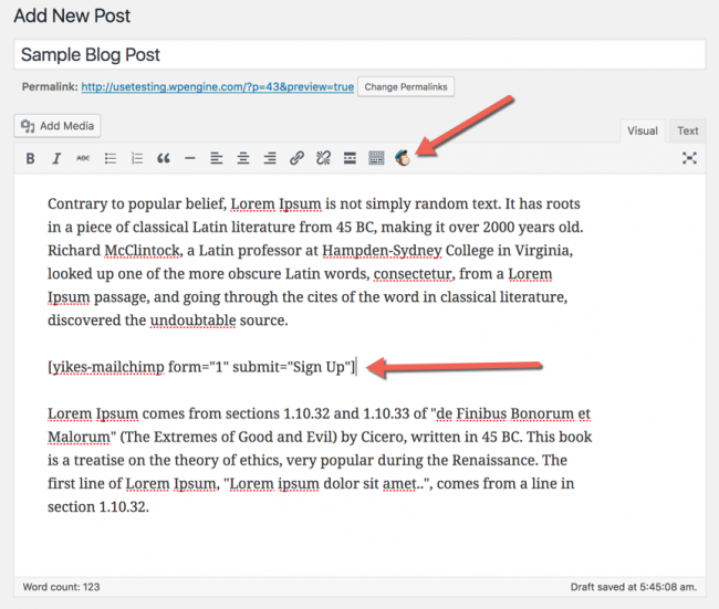
I'll simply end with this. It's easy—like the name says. And it's free—which is never bad (though I highly recommend spending $40 to get those two extensions). And the plugin makes it enjoyable to add those inline forms anywhere you want—with their shortcodes and the supported MailChimp icon in your editor to make things extra easy.
This is truly the best way to create all those forms you know your clients want all over their sites.

